Chart improvements
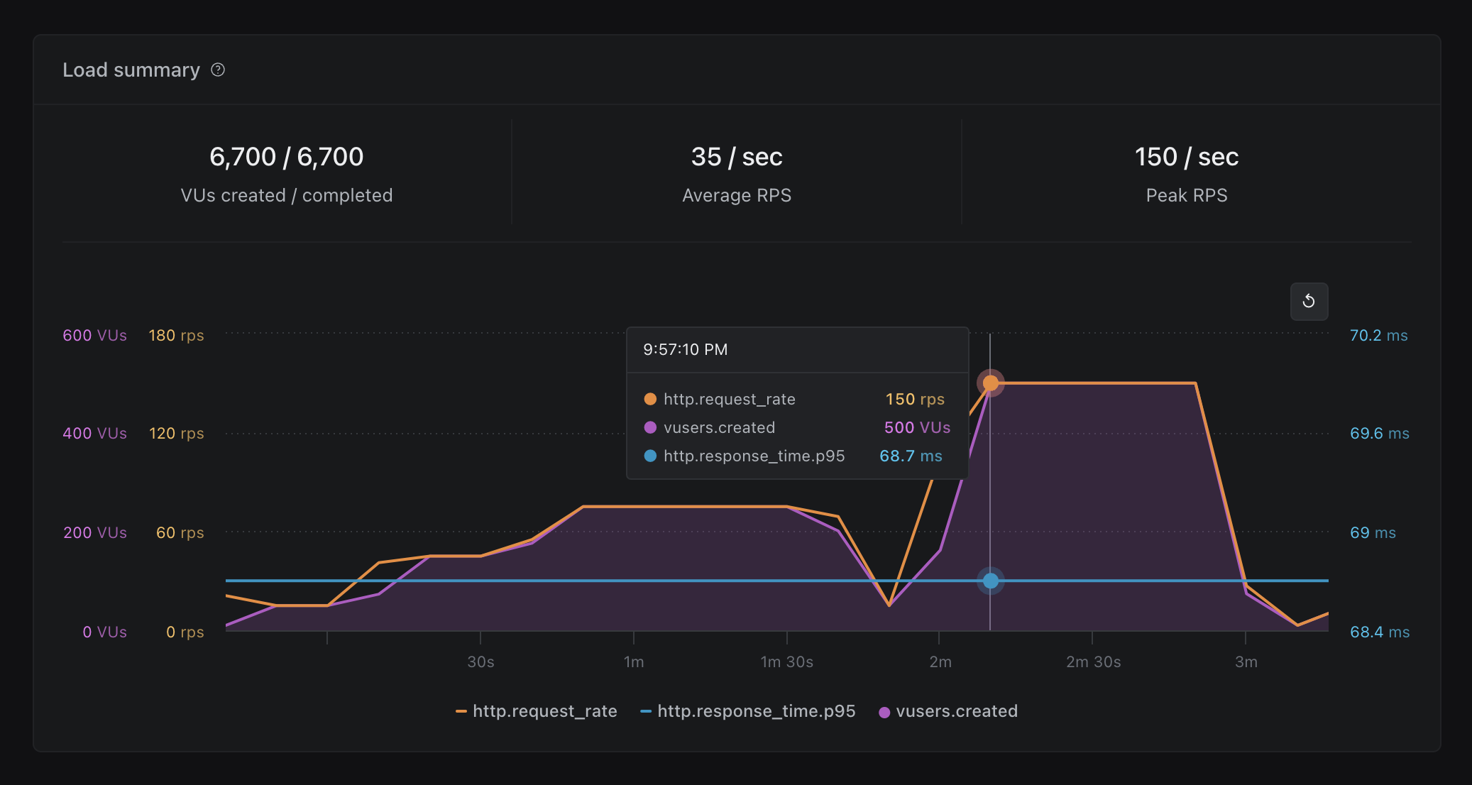
In order to enhance readability and efficiency, we have made the following updates to charts:
- Add timestamp to chart tooltips
- Improve color contrast for easier data comparison
- Ensure consistent chart colors for each metric across different charts
- Provide metric units on both chart axis and tooltips for better chart understanding
- For charts with multiple axis, the axis takes the color of the metric it represents
- Match the color of the chart series with metrics values on chart tooltips
- Group Apdex metrics into one chart on Reports tab
- Improve spacing around Page performance charts
- Fix a bug with the Page performance widget that affected the formatting of the x-axis
Improve load phase visualization
We have also improved the design of load phases on all charts. Changes include:
- Unnamed
pausephases are now labeled aspauseinstead ofphase #n - Differentiate the background of
pausephases from regular load phases - Properly display gaps in data (e.g.
pausephases) - Resolve an issue where load phase names made it difficult to click the reset zoom button
HTTP performance widget
We have introduced a new HTTP performance widget that displays information for all HTTP requests. This widget offers the following enhancements:
- Display percentages and totals of HTTP requests by status code
- Improve the design of HTTP response time distribution chart
- Show the breakdown of response time distribution over time for individual URLs
- Fix an issue with missing zero values on HTTP response time distribution chart